
How can nonvisual innovation benefit both sighted and visually impaired users?
The inclusion of extreme users in the design process results in products that work exceptionally well for everyone. Often this means a differently-abled person influences a universally useful design. However, with my focus on products exclusively used by the visually impaired and blind, I began to understand "extreme" to mean abled.
Could the UX of a screen-reader not satisfy a sighted individual? How might the adaptation of this accessible product for use by a universal audience both advance the product itself and revolutionize the way we use our senses to access technology?
weather challenge- EXPERIMENT 1


"There is so much minutia!
"Each time I heard the word "image," I imagined a large graphic that took over most of the screen."
"The constant talking was stress inducing and most of the info did
not help me to picture the page."
"I tried not to think about the imagery, but I couldn't help it.
I'm so familiar with my screen."
I investigated of the sighted accessibility of screen-readers by teaching peers to use VoiceOver. Each was given twenty minutes to review instructional cards and practice the depicted gestures on his or her phone. Next, I introduced a blindfold and a challenge:
“Please navigate to your email and open the message i’ve sent you. It contains a link to a weather website. Use it to find out what tomorrow’s weather forecast is.”


After transcribing my participants' journeys, I noticed that they were repeatedly hitting a wall, attempting to swipe forward when at the end of a page or closed text container. This appears within the transcripts as stacked, identical text.
behaviors
The absence of clear relationships between individual screen items (content) and between the screen itself and the user's hand (form) influenced many of the behaviors I observed.
trends


When swiping through graphics it is unclear how large or small an "image" is in relation to surrounding text and graphics. In some cases, an icon might seem as prominent as a full screen image.
Ads bars, often located at the top of a mobile site are spatially small, but yield long-winded listening experiences. Lengthy links within them are spoken out letter by letter.
Users are tempted to pan over the screen
in a zig zag pattern as if following a passage of text.When a user's finger is in the center of
the screen it becomes difficult to identify where selected items are relative to the overall shape of the phone.
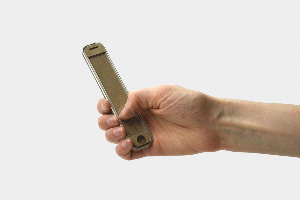
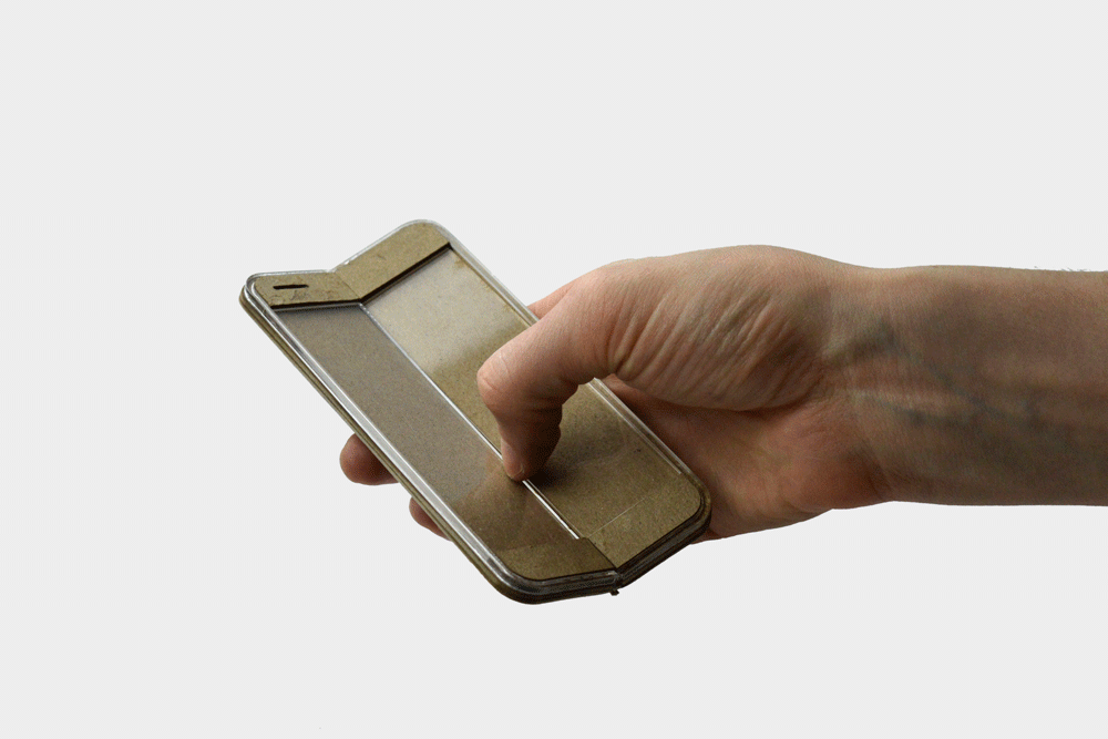
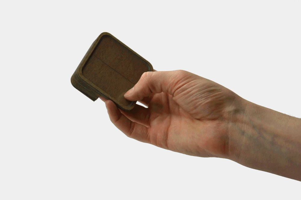
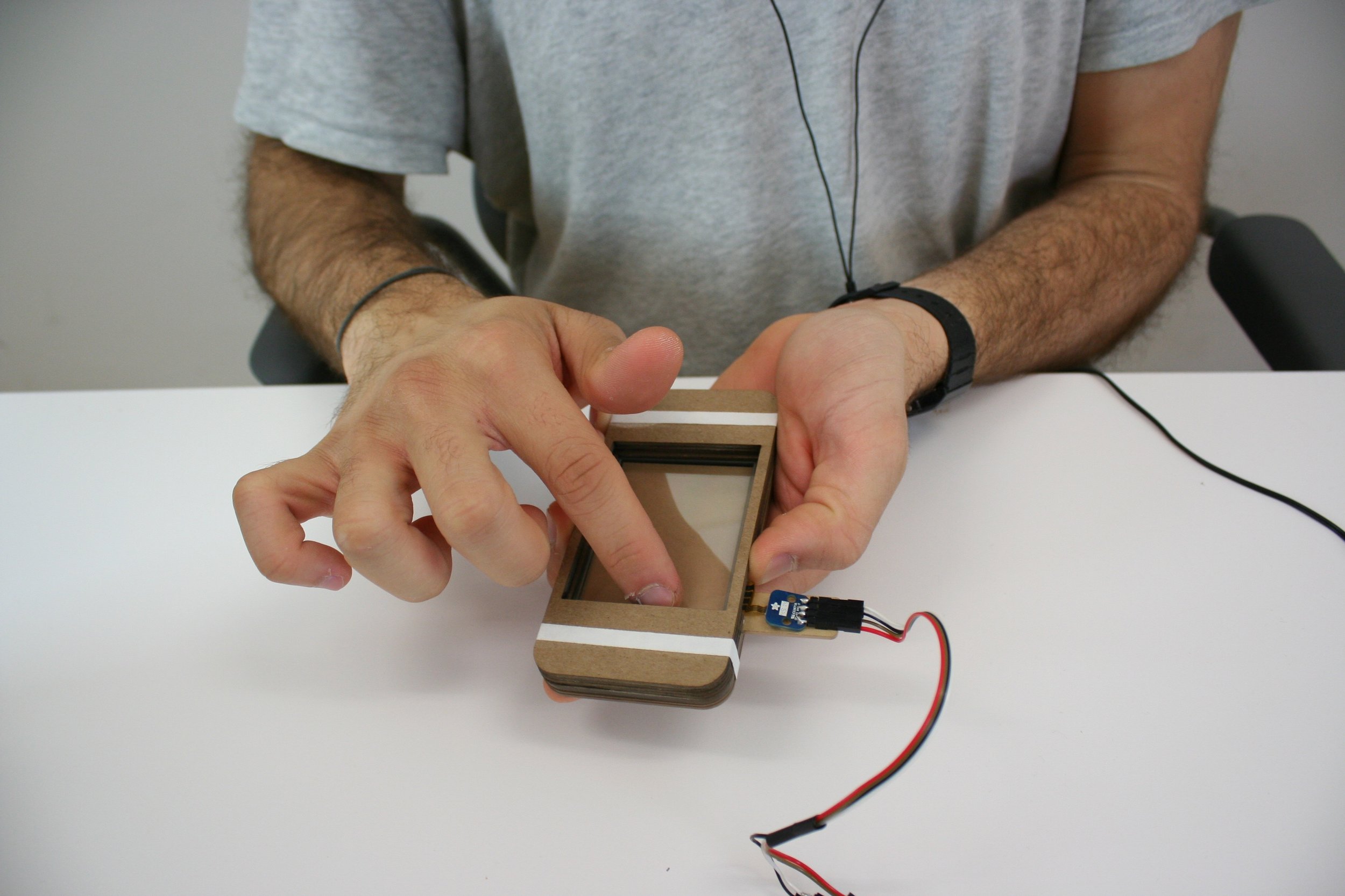
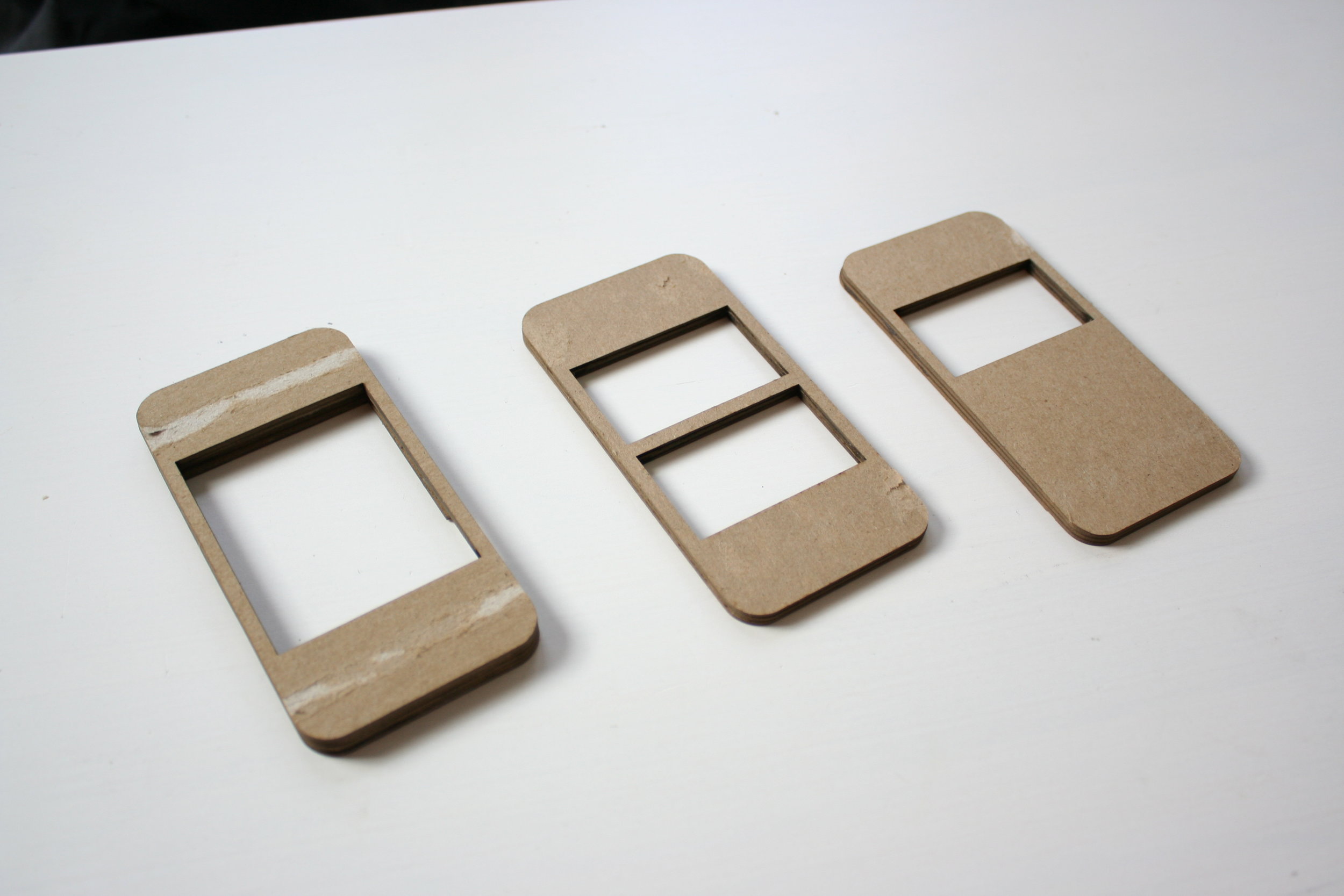
Brick breaking- Prototypes
I considered how the physical form of a phone might better support VoiceOver use.
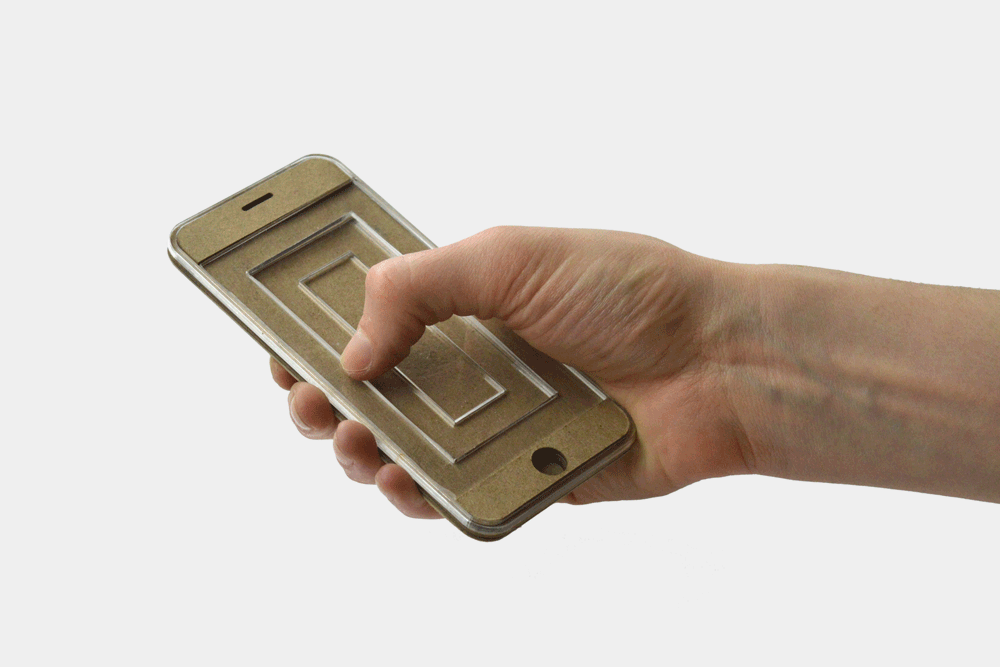
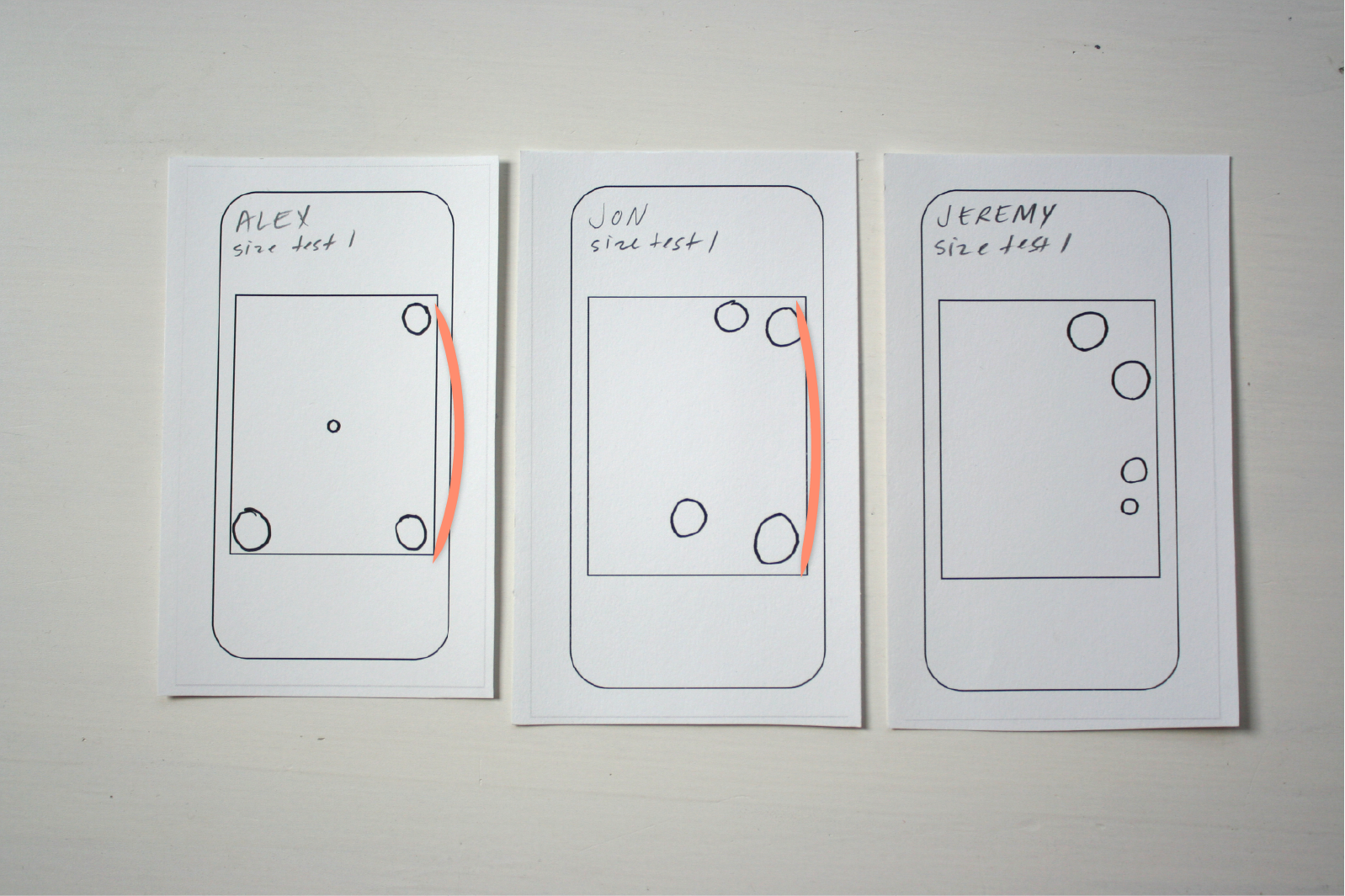
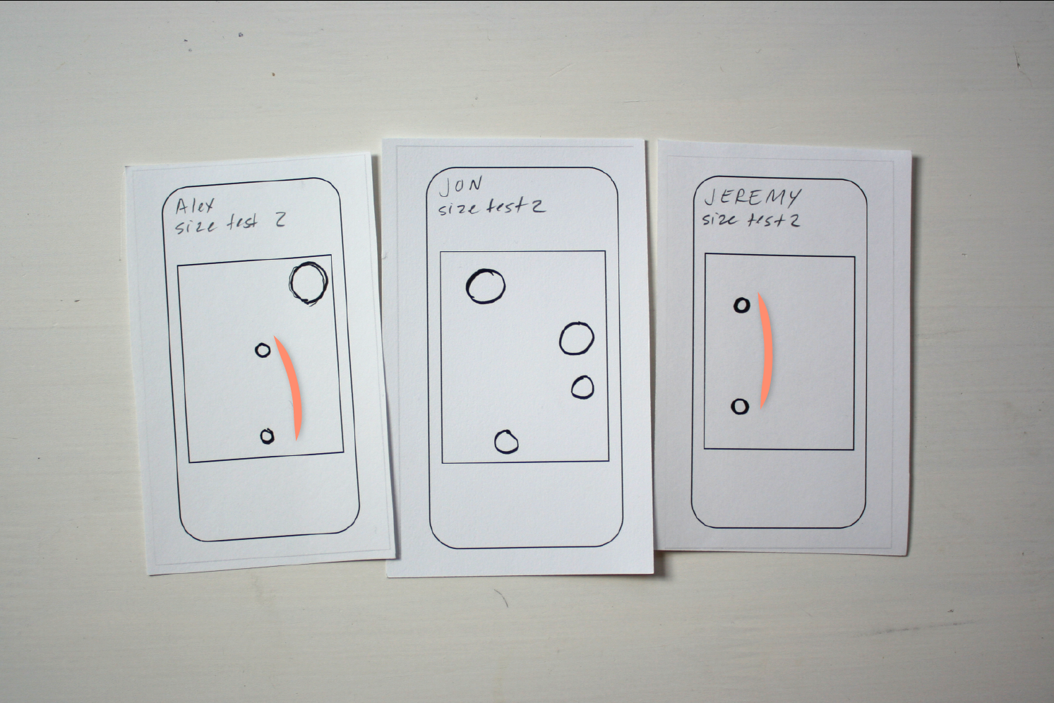
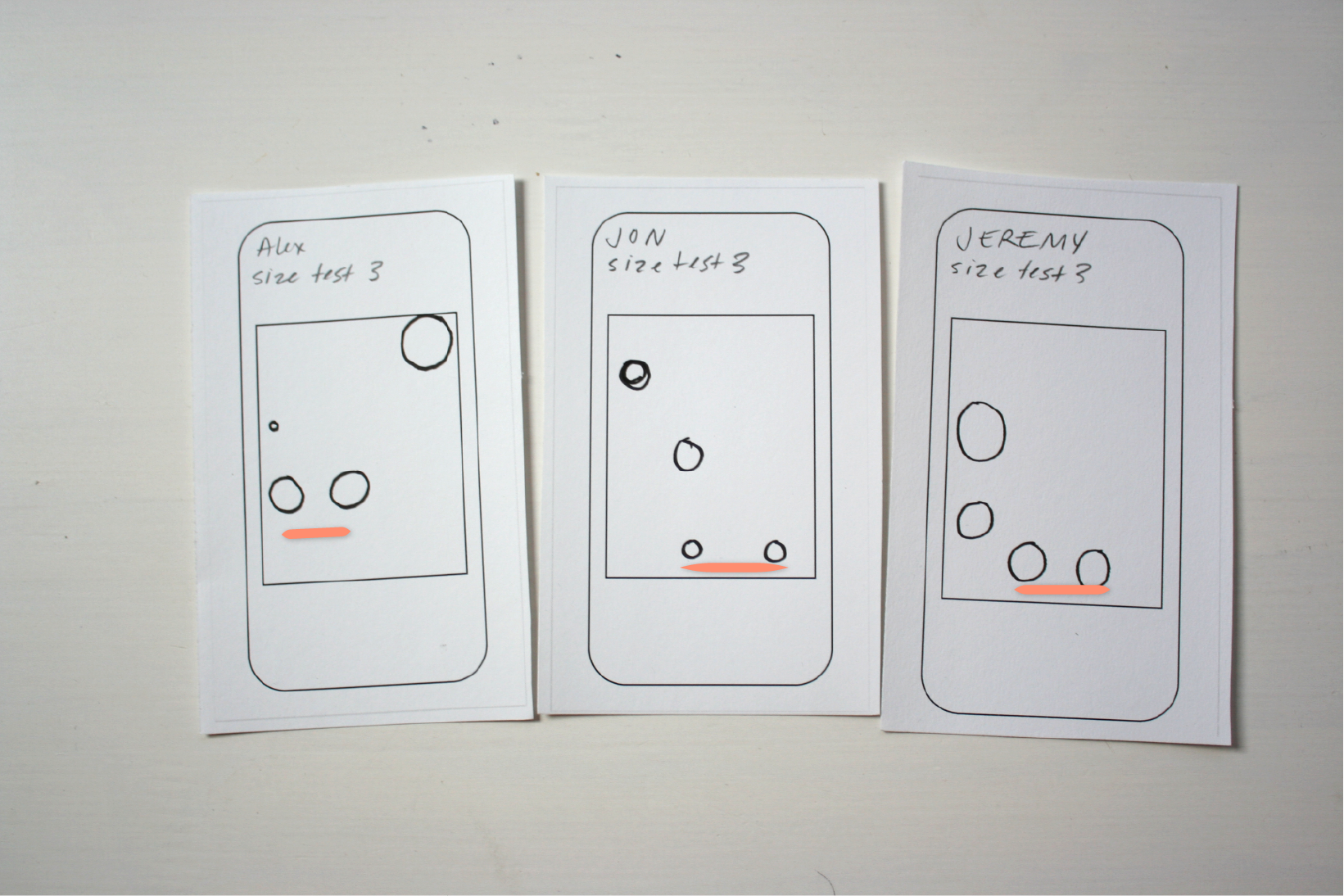
Mapping sound- Experiment 2
I mapped a variety of sounds into a responsive screen and tested how well users could identify their origins and prominence. I was curious about how their interactions with the screen would be affected by the various bezels/bumpers I attached to it.

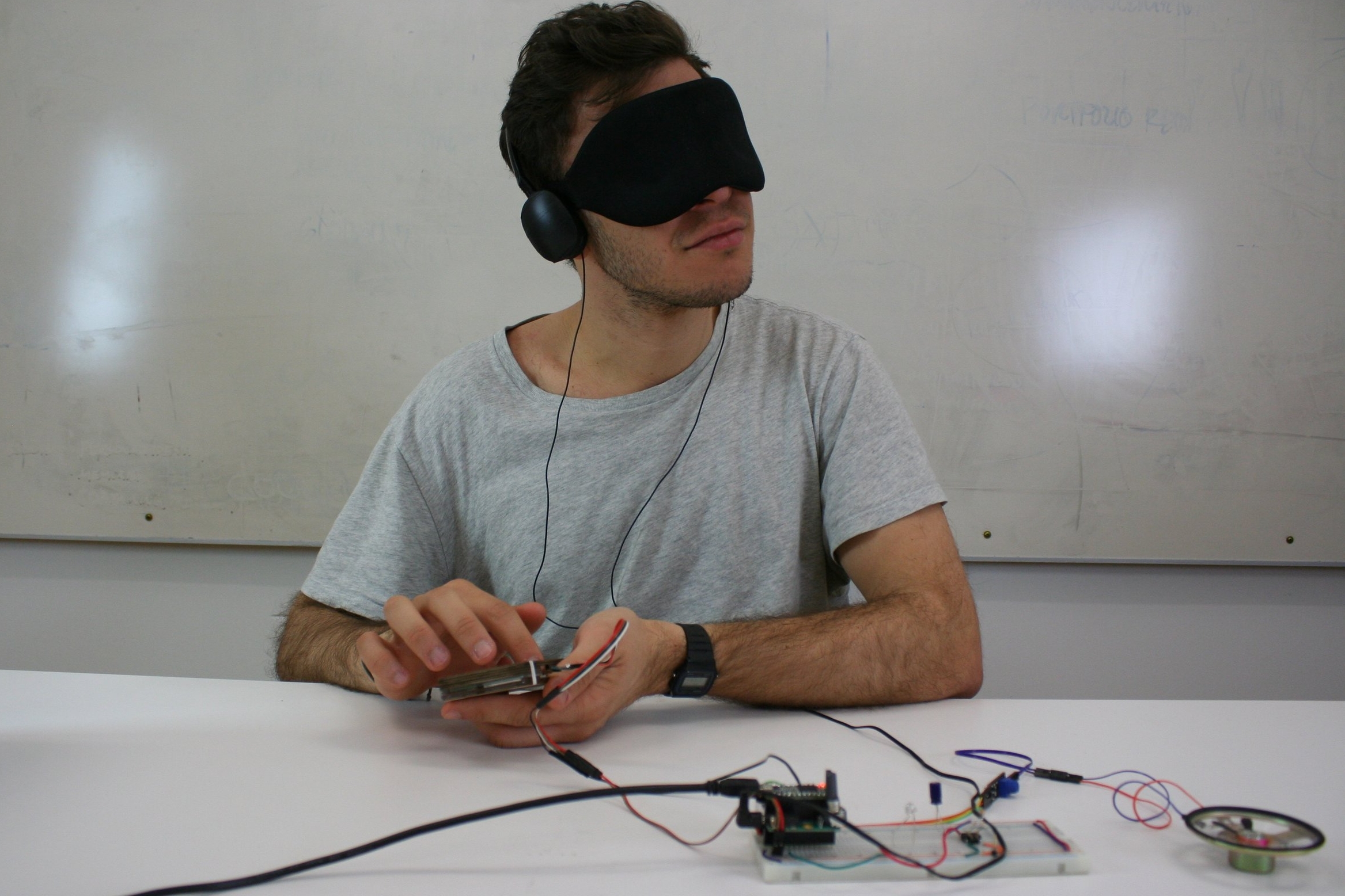
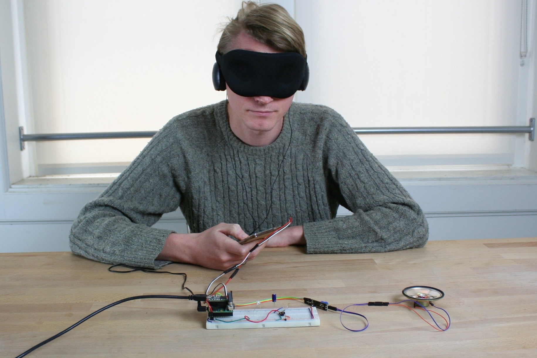
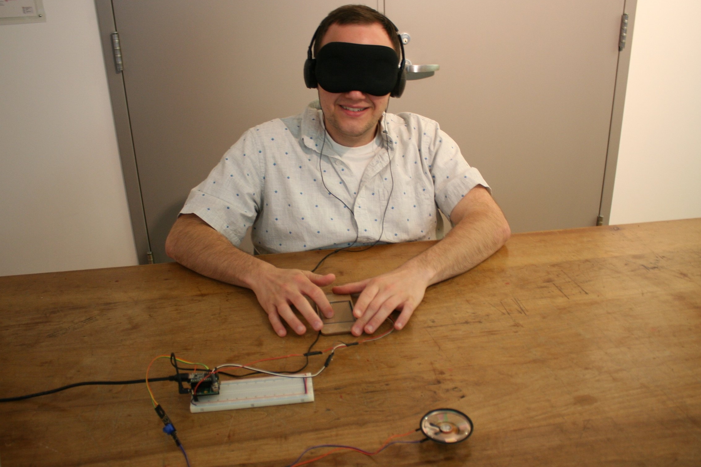
Ultimately there was a great deal of diversity in my participants responses (possibly due to the poor responsive quality of the touch-screen I had employed.) But I did notice some important patterns.
Participants often used pinky fingers to explore screen space closest to the bumpers.
Most often participants were successful in mapping sounds when they were arranged along the x or y axis of the screen.
Participants had to exert extra pressure (due to the quality of the screen) and overtime their fingers seemed to loose sensitivity.
Participants moved their fingers along the pronounced bumper forms with greater speed and confidence than the central screen area.


